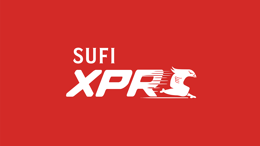
Sufi XPRS
Rebranding Simply Sufi XPRS with a bold identity, vibrant packaging, and an innovative, user-friendly dip attachment to enhance fast-food convenience and reflect brand trust.
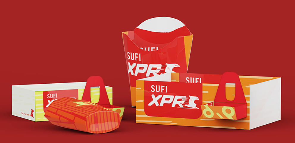
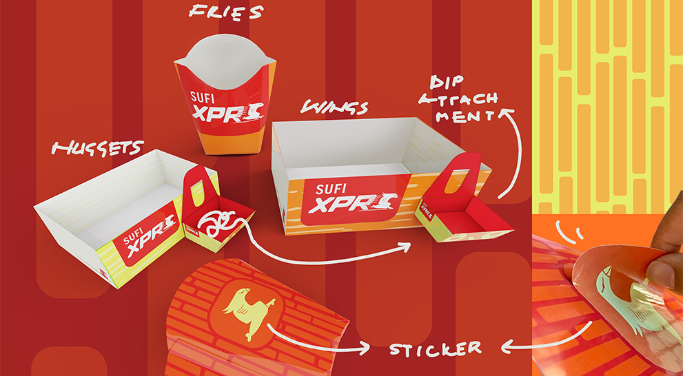
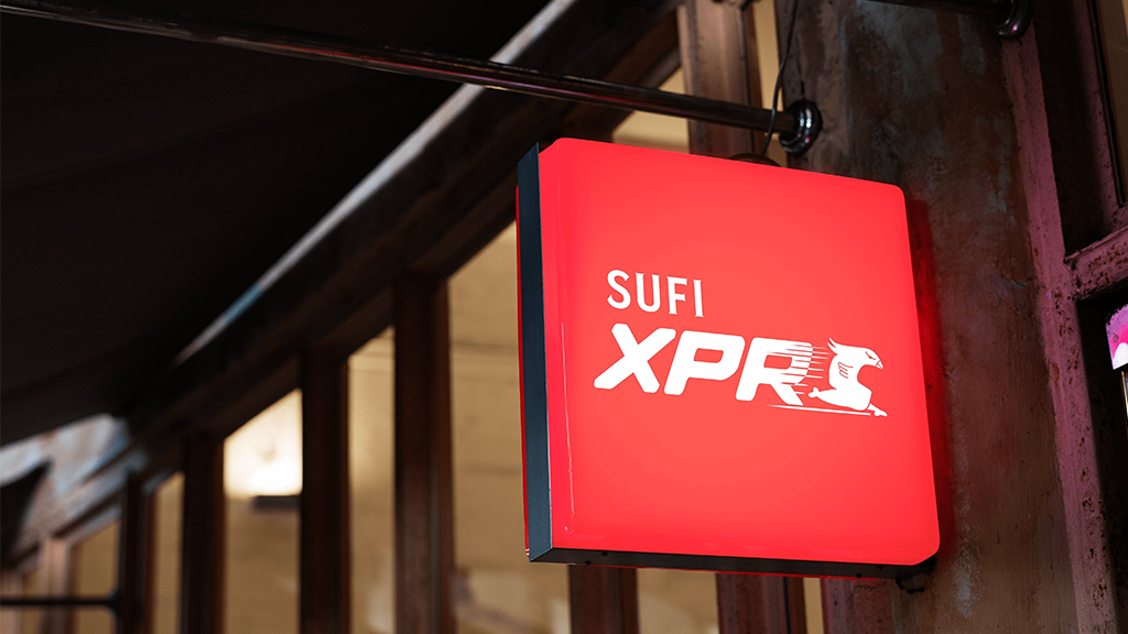
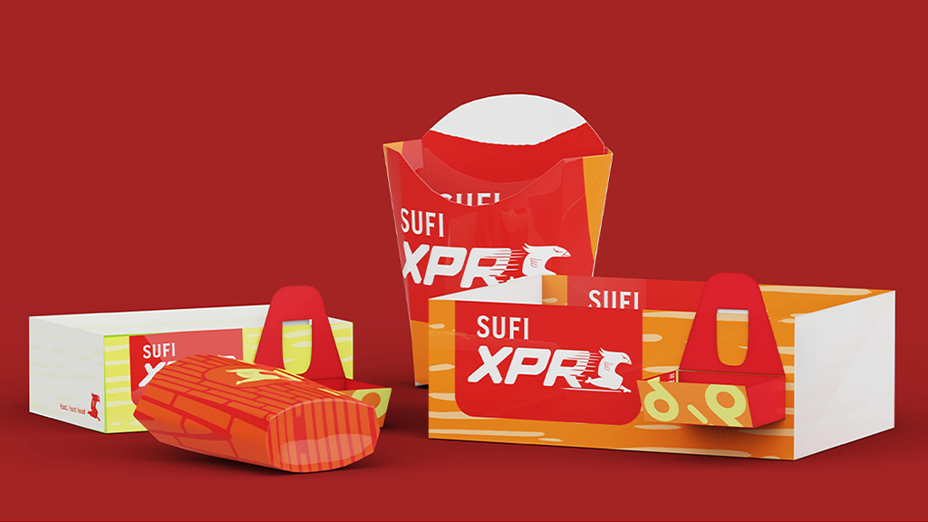
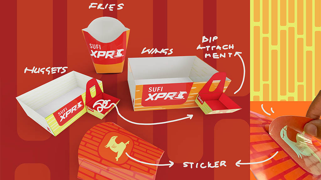
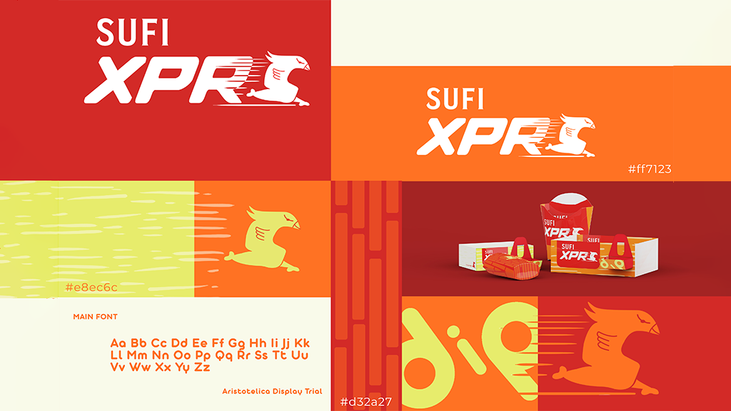
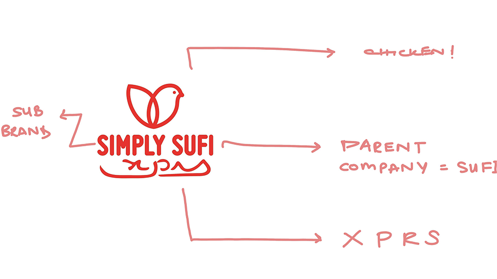
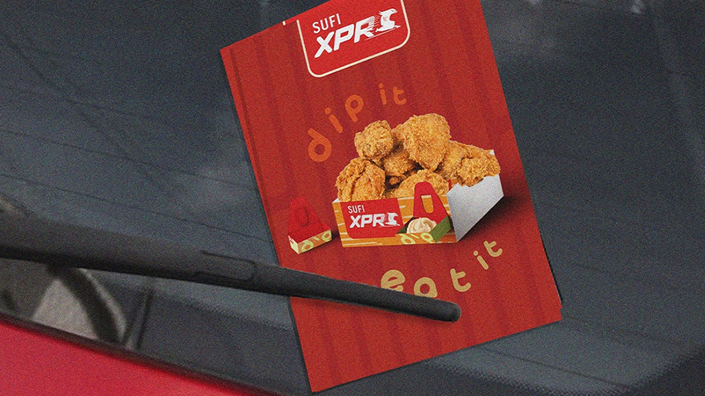
This rebranding project focuses on Simply Sufi XPRS, a fast-food chain by the well-known Sufi Corporation, recognized for its trusted product range across Pakistan. The goal is to rebrand and repackage the local brand to better reflect its identity, values, and meet customer expectations. The rebranding process begins by identifying core elements like reliability, fast service, and a strong link to its parent brand. These values are visually translated through a dynamic new identity featuring a chicken mascot, symbolizing speed and energy. The logo reinforces trust and brand recognition among potential customers. Color choices of vibrant red and orange are strategically selected to stimulate appetite and evoke excitement, making the emotions central to a fast-food experience. Alongside the visual overhaul, functional improvements are made in packaging. A key innovation is the introduction of a user-friendly dip attachment which is spill-proof, self-assembled, and reusable. It adds convenience by allowing users to place it anywhere, reducing waste while improving the overall dining experience. The project combines thoughtful design with brand storytelling to create a refreshed, customer-centered identity for Simply Sufi XPRS.